
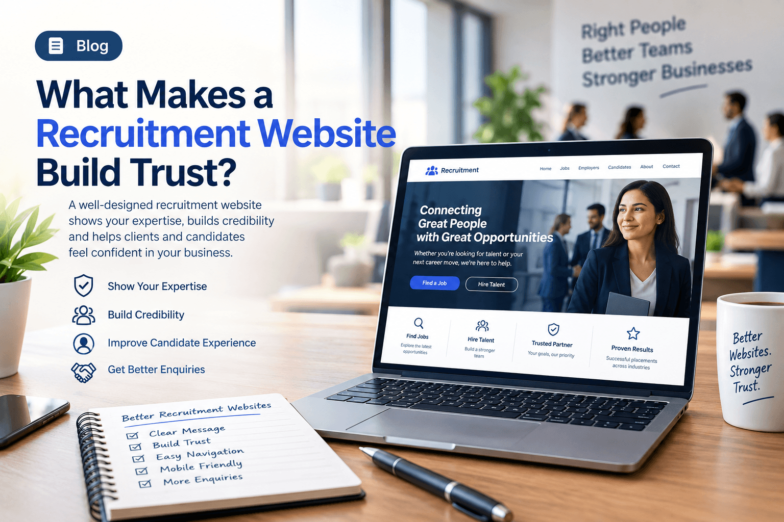
Picture a hiring manager on a Monday morning with three recruitment firms on a shortlist. The services sound similar. Each company says it has experienced consultants and access to skilled people. The difference often appears before anyone picks up the phone: one website makes the business feel specific and organised, while the others leave the reader guessing.
Recruitment is built on trust. An employer is trusting a recruitment business to understand the brief, represent the organisation properly, and introduce people who are genuinely suitable. Candidates are making a similar decision in the opposite direction. They are trusting a company with their career, personal information, and sometimes a major change in their life.
That raises a practical question: why should someone trust your company? The answer is rarely a sentence that calls the business reliable, experienced, or professional. People look for evidence. They want to know who you are, what type of recruitment you specialise in, which industries you serve, how the process works, and whether the company looks capable of delivering what it promises.
A referral, a LinkedIn message, a job advert, or a Google search may create the first spark. The website is often where that spark either becomes a conversation or quietly dies. Candidates ask the same questions in different language. Is this company genuine? Does it understand my industry? Are the opportunities legitimate? Will anyone actually guide me through the process?
This is why Recruitment Website Design should not be treated as a visual exercise. A professional recruitment website has to communicate the business clearly and reduce uncertainty for the people considering working with it. Strong design creates a first impression. Useful content creates understanding. Real experience and testimonials create credibility. Clear service and contact pathways turn that confidence into a conversation.
When those elements work together, the website stops being an online brochure and starts doing sales work. It becomes part of how the recruitment business explains itself, qualifies the right visitors, and invites the next step.
If your current site cannot do that, ClickIconic can help you rebuild the pages around trust, clarity, and enquiries rather than around decoration.
1. Start With a Strong First Impression
A visitor does not need your full company history on arrival. They do need the essentials within a few seconds: what type of recruitment you provide, which industries you serve, whether you work with employers, candidates, or both, and why the business is worth a closer look.
A hiring manager who opens your site after a LinkedIn message is checking whether this looks like a serious firm. A candidate who opens the same page after seeing a vacancy is checking whether the opportunity, and the company behind it, feel real. A recruitment company website has to serve both of those first glances at once.
The homepage should establish the context immediately. A workforce business supplying skilled technicians to European plants needs that focus on the first screen. A specialist IT recruiter needs to communicate technical recruitment, not a generic line about connecting talent with opportunity. An executive search practice needs to communicate seniority, discretion, and market knowledge.
The exact wording depends on the business. Visitors should not have to hunt through slogans, stock photography, or a layout that could belong to any service company. A recruitment agency website that could be swapped with a competitor's homepage is already leaking trust.
First impressions are also about pace. If the page loads slowly, the layout jumps, or the menu hides the thing people came for, confidence drops before a paragraph has been read. In practice, recruitment website performance is part of trust, even when nobody uses that phrase out loud. That is one of the first jobs of Recruitment Website Design, whether you are launching a new site or improving an established one.
Make the First Few Seconds Count
Show the homepage to someone outside the business for ten seconds, then ask what the company does and who it helps. If the answer is vague, fix the message before adding animation or extra decoration. Strong design should support clarity rather than hide it.
2. Make It Clear What Your Recruitment Business Actually Does
One of the biggest trust problems on recruitment websites is a lack of commercial clarity. A visitor may understand that the company 'does recruitment' and still have no idea whether you fill permanent roles, supply contract labour, specialise in one industry, recruit internationally, or work with both employers and candidates.
A recruitment business website should answer those questions without making people work for the information. Generic lines such as 'Connecting talent with opportunity' can sound polished while explaining almost nothing.
Clear recruitment service pages solve most of this. Each important service should say what you provide, who it is for, what type of roles or workforce it covers, and why the company is qualified to deliver it. That matters even more for businesses operating across countries or specialised trades, because the visitor is trying to decide whether they have reached the right firm.
The more specialised the model, the more dangerous a generic template becomes. The website should reflect how you actually recruit. Good Recruitment Website Design therefore starts with understanding the business, then designing pages around that model rather than around a borrowed layout.
Remove the Guesswork
Read your homepage as if you have never heard of the company. Within a few seconds, can a visitor tell what type of recruitment you provide, which industries you serve, and whether you can help them? If not, the message needs to become clearer before any visual redesign begins.
3. Demonstrate Real Recruitment Expertise
Clients are not only buying access to CVs. They are buying judgement: someone who understands the industry, the role, the skills required, and the difficulty of finding people who will stay. Candidates benefit from the same understanding. That expertise has to be visible, not merely claimed.
A short note on screening healthcare candidates, a plain explanation of how you onboard skilled trades in a new country, or a sector page written in the language of that market tells a visitor more than a banner that says 'industry experts'. Useful, focused information is enough. You do not need a publishing calendar that nobody will maintain.
This is also where a workforce recruitment business can separate itself from a job board. The value is not only volume. The value is knowledge of the work, the compliance, and the people. A workforce recruitment website that explains those things starts to feel like a specialist organisation rather than a listings page.
Consultant profiles help for the same reason. Clients want to know who they will speak to. Candidates want to know whether the person behind the vacancy understands their career. A faceless brand asks people to trust an organisation they cannot picture.
Show What You Know
Look at the questions your recruiters already answer every week. Many of those answers can become useful website pages. Specific knowledge is usually a stronger reason to make contact than another claim that the company is experienced.
4. Build Trust With Real Evidence
Trust is easier to build when visitors can see evidence instead of slogans. A recruitment company can say it is experienced, specialist, or reliable. Those words only start to mean something when the site shows why they are true.
A named client comment about a filled operations role is stronger than a gold-star graphic. Candidate stories show how the company treats the people it places. Introducing recruiters, founders, or account managers makes the business feel human. Visitors may also want an office location, the markets you serve, how long you have operated, and who will respond if they get in touch.
Relevant memberships, certifications, registrations, or industry affiliations help where they genuinely apply. These are recruitment website trust signals. They contribute to recruitment company credibility because they let visitors judge the business from proof rather than promises.
This is how recruitment website trust is actually built: small, specific, current details that can be checked. A broken contact form, an old copyright date, or a vacancy from two years ago can undo a polished layout. Proof has to be maintained, not added once at launch and forgotten.
Replace Claims With Proof
Review every statement that says the business is experienced, trusted, professional, or different. Place evidence beside the claim: real people, permissioned testimonials, candidate stories, and business information a visitor can verify. If the proof is thin, that is a content problem, not a design flourish waiting to happen.
5. Explain the Recruitment Process Clearly
Recruitment feels risky when people cannot picture what happens after they make contact. An employer wants to know how you will understand the brief, identify candidates, assess suitability, and support hiring. A candidate wants to know who reviews an application, what information is needed, and what the next stage looks like.
The website does not need every internal procedure. It does need enough method to reduce uncertainty: brief, search, screen, introduce, and support after placement, written in language that matches how you actually work. International workforce businesses often need to explain sourcing, assessment, preparation, and on-the-ground support as well.
Good recruitment website content answers those questions without burying the reader. When people understand what happens next, sharing a brief or a CV feels like the start of a professional process rather than a message sent into a void.
Make the Process Visible
Take the explanation your team already gives on calls and turn it into a simple website journey for clients and candidates. The aim is not to expose every internal step. It is to help visitors understand what they are walking into.
6. Speak Clearly to Both Clients and Candidates
Most recruitment businesses have two audiences with different questions. Clients want the right people with less hiring risk. Candidates want a genuine opportunity and a recruiter who will treat them as more than a file. One generic homepage message usually serves neither group well.
Give each audience a visible path. An employer should be able to reach services, sectors, workforce supply, or a way to send a brief. A candidate should be able to search roles, understand the application process, submit a CV, or learn who the company is. The site can still feel like one brand. The journeys should not be mixed into a blur.
Weak staffing website design shows up when vacancies are hidden and every page is written for the employer. A staffing company website should also respect the candidate experience: filters that work, forms that do not demand a life history before a role is visible, and contract type explained in plain language.
The same is true of the client recruitment journey. If a hiring manager cannot see how to send a vacancy or speak to a consultant, the site is asking them to work too hard. Strong recruitment job pages should read like a serious brief: role, location, contract type, who the hiring company is where you can say, and what happens after applying.
The same is true of workforce website design when the business supplies labour at scale. Clients still need to understand capability. Workers still need to understand how engagement works. Clarity is not a luxury for either side.
Give Each Audience a Clear Path
Write down what employers and candidates each need to know before they contact you. Then check whether those paths are obvious in the navigation, the homepage, and the first screen on a phone. If one audience has to hunt, the structure is not finished.
7. Make the Recruitment Website Easy to Use on Mobile
A large share of first visits now happen on a phone: a candidate on a commute, a client checking you after a call, a referred contact opening a WhatsApp link. If the experience is awkward on a small screen, the business looks less ready than it is.
Good recruitment website mobile design is not a shrunken desktop layout. Text has to be comfortable to read. Menus have to be simple. Buttons have to be easy to tap. Forms should not lose information when the keyboard opens. Important contact options should stay easy to find. Images should look professional without making pages slow.
The recruitment website user experience on mobile is often the difference between a saved vacancy and a closed tab. A site that works smoothly on a phone also tells visitors that the company has considered how they actually use it, not only how it looks on a studio monitor.
Test the Website as a Client and a Candidate
Open the site on a real phone and complete the important journeys yourself. Try to understand the services, find a relevant job or workforce solution, locate contact details, and submit an enquiry. Anything that feels fiddly deserves attention before you spend on more traffic.
8. Build Recruitment SEO Into the Website
A recruitment business cannot build trust with people who never find it. Clients search by industry, location, workforce type, specialist role, or service. Candidates search for jobs, employers, locations, and recruitment companies. Search visibility therefore belongs in the build, not in a cleanup task after launch.
A useful recruitment website strategy starts with the services, sectors, locations, and job types the business actually wants to be found for. Trying to rank for every recruitment phrase in every country usually produces thin pages. Focusing on the work you win most often produces pages that can compete.
Good recruitment website SEO is not a matter of repeating the same phrase on every page. It is a matter of matching search intent with useful pages: industry pages, service pages, role-specific content, location pages, candidate resources, employer guides, and FAQs that answer real questions.
Technical foundations still matter. Clear recruitment website navigation, page structure, internal linking, titles, headings, descriptive URLs, image alt text, mobile-friendly layouts, and sensible indexing help both people and search engines understand the site. Ranking for a phrase is only useful if the page can also convert the visit.
Build SEO Around Real Recruitment Searches
Before choosing a long keyword list, identify the questions, services, roles, industries, and locations your best clients and candidates already search for. Build useful pages around those topics, then use the language naturally in titles, headings, body copy, and internal links.
9. Show What Makes Your Recruitment Business Different
Recruitment markets are crowded. Several firms may offer similar services, serve the same industries, or claim access to similar talent. A generic website makes that sameness worse. A recruitment firm website should make its position visible on the first visit, not only in a pitch deck.
What do you understand particularly well? Which industries do you know best? What type of workforce do you specialise in? Which markets do you serve? What do clients and candidates actually value about working with you? Write those answers in operating terms: one discipline, a compliance process others avoid, consultants who have done the job themselves, relocation support, or international workforce supply rather than local permanent search.
The point is not to invent a slogan. It is to uncover what is already valuable and put it where a visitor can see it. When that difference is clear, the recruitment business online starts to feel like a specialist organisation rather than another interchangeable site. If the website cannot explain why a client should choose you over two similar firms, the conversation will default to speed and fee.
Make Your Difference Visible
Ask existing clients and candidates why they chose you and what they remember about working with you. If a happy client would say you already knew the market and did not send random CVs, put that idea on the site in your own words. If the only unique line you can write is 'we care', the positioning is not finished.
10. Make It Easy for Clients and Candidates to Take the Next Step
A visitor who has spent time on the site has already shown interest. The next step should be easy. That does not mean asking every person to 'Contact us' in the same way. An employer may want to discuss a workforce requirement. A candidate may want to submit a CV. A prospect may still be comparing firms.
Too often, recruitment website enquiries stall because contact is hidden in the footer, forms ask for too much too soon, or there is no sense of who will respond. Useful actions might include 'Discuss your recruitment needs', 'Hire skilled workers', 'Submit your CV', or 'Talk to a consultant'. The form should collect enough to start a useful conversation without becoming an interrogation.
Say what happens next. Will someone respond within one business day? Will a consultant review the brief? Will the candidate be contacted about suitable roles? Small details like these reduce uncertainty. Good recruitment website conversion is not about forcing a click. It is about making contact feel like the natural continuation of a professional conversation.
Make Contact Feel Like the Beginning
The enquiry or application process should feel like the start of a working relationship, not an administrative hurdle. Keep it clear, relevant, and easy to complete on a phone. If the site explains the business well but rarely starts conversations, ClickIconic can review the paths that should be creating enquiries.
11. Know When an Outdated Recruitment Website Is Holding You Back
A recruitment business can have years of market knowledge and still be represented by a site that belongs to an earlier version of the company. An outdated recruitment website may have been built when the team was smaller, the sectors were different, or the brand was less established. The business moved. The website did not.
That creates a credibility gap. A potential client sees dated branding, old vacancies, weak mobile use, or missing people, then has to decide whether the company behind it is as professional as the service being promised. Candidates feel the same hesitation. They rarely complain. They open the next tab.
A recruitment website redesign should therefore be more than new colours, images, and fonts. It is a chance to rebuild the journey: what visitors need to understand, where they hesitate, what evidence is missing, and where they should go next. The goal is to represent the business accurately, not simply to make the pages look newer.
Redesign the Experience, Not Just the Appearance
If the recruitment business has changed, the website should change with it. Review positioning, content, structure, trust signals, mobile experience, SEO, and the enquiry journey before deciding what the new visual design should look like. ClickIconic plans redesigns in that order so the new site does commercial work, not only cosmetic work.
12. What to Do When Your Recruitment Website Is Not Generating Enquiries
One of the most common frustrations in this market is a site that receives visitors and produces very few conversations. If you have a recruitment website not generating enquiries, treat it as a diagnosis rather than a mystery, and look for the confidence gap before assuming you simply need more traffic.
Sometimes traffic is the issue. Often it is not. If the right people are already arriving and leaving, the homepage may not explain the offer. Service copy may be too generic. Expertise may be invisible. Testimonials may be hard to find. The process may be unclear. The next step may be buried. Mobile users may be hitting friction. Several of these can be true at once.
If your recruitment website is not generating enquiries, ask where visitors lose confidence. Do they understand what you offer and who you specialise in? Do they see enough evidence? Do they know what happens after contact? Do they know what to do next? The answers usually show which pages need work before you spend more on advertising.
Find the Confidence Gap
Before trying to generate more traffic, identify what is stopping existing visitors from moving forward. Improving clarity, trust, positioning, content, usability, and the enquiry journey can make the traffic you already have more valuable. If you cannot see where the journey is breaking down, ClickIconic can review the website from the client's and candidate's point of view and identify what needs attention before a full rebuild is considered.
The goal is not to convince every visitor to enquire. The goal is to help the right clients and candidates understand the recruitment business, trust the organisation, and feel comfortable starting a conversation.
13. What to Look for in a Recruitment Website Design Partner
Choosing someone to build or redesign the website is a commercial decision. The site represents the business before a client or candidate has spoken to anyone on the team. The partner therefore needs to understand more than colour palettes.
Specialist website design for recruitment companies is a demanding brief: two audiences, hiring risk, job content, and the way consultants actually win work. A recruitment website designer should ask about sectors, fee models, candidate flow, and sales conversations before talking about visuals. That is what good recruitment website design services should include: positioning, structure, copy direction, and enquiry paths, not only mockups.
The same applies to recruitment website development. Technical implementation should support speed, mobile use, accessibility, SEO, content structure, and the ability to update vacancies without calling a developer every time. If you need a recruitment website development company, ask how those things will be handled after launch.
In most cases, custom recruitment website design is the better route when the business has a defined market. It allows the site to match the way you recruit rather than forcing the company into a layout built for someone else. At its best, recruitment business website design should feel like an extension of the consultancy, not a rented theme with a logo placed on top.
A recruitment website consultant should look beyond individual pages and consider positioning, trust, content, usability, SEO, and the complete customer journey. ClickIconic works in that way: we start with how the recruitment business needs to be understood, then we design and build the site around trust, clarity, and contact.
- ✓They begin by understanding the recruitment business and its audiences
- ✓They understand the importance of trust in recruitment
- ✓They can structure recruitment services and industries clearly
- ✓They know how to present expertise without overwhelming visitors
- ✓They understand the role of genuine testimonials and trust signals
- ✓They consider client and candidate journeys from the beginning
- ✓They consider mobile users from the beginning
- ✓They understand SEO foundations and search intent
- ✓They connect design decisions with the customer journey
- ✓They make the enquiry and application process clear and simple
- ✓They avoid unnecessary features and complexity
- ✓They create a website that reflects the actual recruitment business rather than a generic template
Choose Someone Who Understands the Business Behind the Website
The strongest website decisions come from understanding the recruitment business, its clients, candidates, industries, markets, and goals. Ask potential partners how they plan to understand those things before they begin designing pages. If you want that conversation with ClickIconic, the next step is a website review rather than a guess at a new look.
The right partner should not simply build a recruitment website. They should help turn the knowledge, experience, personality, and credibility of the recruitment business into a digital experience that clients and candidates can understand and trust.
14. What a Trust-Building Recruitment Website Should Achieve
There is no single visual formula for a successful recruitment website. Good recruitment web design should reflect the actual business, its audiences, industries, markets, and recruitment model. A specialist technical recruiter needs a different site from an international workforce company. A staffing firm has different priorities from an executive search practice.
What they should share is a site that understands the concerns of the people visiting it. It should make the business easy to understand. It should make services and workforce solutions easy to explore. It should demonstrate real knowledge of the industries and roles being served. It should provide evidence that helps visitors feel comfortable considering the company.
It should answer questions before contact, work properly on mobile, and provide a foundation for search visibility. That foundation should support the wider digital presence for recruitment companies rather than treating the website as an isolated brochure. It should make important information easy to find and give visitors a clear next step.
That is the real purpose of Recruitment Website Design. Not simply to make a recruitment company look impressive online, but to communicate enough value, expertise, credibility, and clarity that the right client or candidate feels comfortable starting a conversation.
Your Website Should Carry Part of the Trust
A potential client or candidate should arrive with questions and leave with greater confidence. Every page, photograph, piece of content, testimonial, service description, and call-to-action should contribute to that journey. If your current site cannot do that, ClickIconic can help you set the standard and build it.
Recruitment Website Trust Checklist
Frequently Asked Questions
Key Takeaways
- ✓Recruitment businesses need to build trust before a client or candidate is ready to make contact.
- ✓Recruitment Website Design should communicate more than a professional visual appearance.
- ✓The website should make recruitment services and workforce solutions easy to understand.
- ✓Industry and recruitment expertise can become one of the strongest trust-building assets on the website.
- ✓Real testimonials, team information, candidate stories, and business details provide meaningful evidence.
- ✓Useful recruitment website content should answer the questions clients and candidates have before contacting the business.
- ✓Clear recruitment processes make the customer and candidate journey easier to understand.
- ✓A strong mobile experience is essential because much of the research now happens on a phone.
- ✓Recruitment website SEO should be considered while planning the website.
- ✓The website should clearly communicate what makes the recruitment business different.
- ✓Clear calls-to-action make the transition from visitor to enquiry or application easier.
- ✓An outdated recruitment website can weaken confidence even when the actual recruitment business is experienced.
- ✓A recruitment website redesign should improve the customer and candidate journey rather than simply change the visual style.
- ✓The strongest recruitment websites make the business easier to understand, easier to trust, and easier to approach.
Is Your Recruitment Website Building Enough Trust?
Your recruitment business may already have experienced recruiters, strong industry knowledge, successful placements, and satisfied clients. If the website is not communicating those strengths clearly, or is not generating the enquiries you expect, ClickIconic can help you identify what needs to improve across strategy, structure, content, design, trust, mobile experience, SEO, and conversion.
Review Your Recruitment Website With ClickIconic